I did a guest post over at Daisy Chain Book Reviews yesterday on Summer Covers. Check it out here.
******************
The Secret Year - Jennifer R.Hubbard
******************
The Secret Year - Jennifer R.Hubbard

 << Hardback
Paperback <3 >>
I actually really love this PB cover and l think it definitely shows off what sort of genre the book is because a lot of YA genre have these sort of covers. I really like the font of the title too!
The HB is kinda strange, they look like they are eating each others faces, or is it just me who thinks that? Like the font though and red on black. Just looks much more of a 'cheaper' cover than the HB!
~

 >> Hardback
Paperback <3 <<
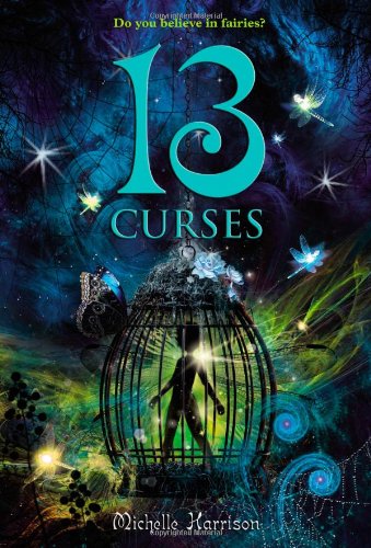
The PB (UK) it definitely better face to face than on a computer screen as it's more shiny etc. The PB is definitely a very busy cover and l do like it, just don't love it. The font is simple but doesn't get in the way of the picture (l know half the title is the picture!) The HB is just .. quite .. terrible. I think it makes the book look like it's for much younger readers, maybe 12/13 year olds. Also makes it feel rather magically which is not really what l look for in books.
~
 >> Hardback <3
Paperback <<
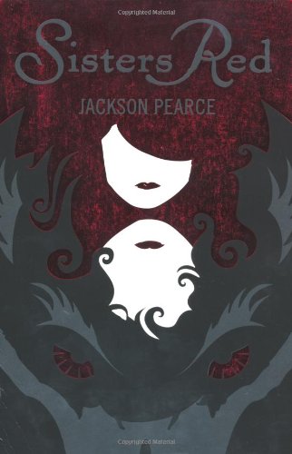
These covers are both very alike and the PB just made me realise that it's a wolf and the red on the HB is it's eyes.. how cool! Yes l did only just notice that.
I do like the PB but l think the HB stands out much more and l really do love red with black. Also love the font of the title and the positioning of the text as it doesn't get in the way of the picture but has instead became a part of it.
~
Please note, some covers l feature are also in other formats. For example a HB cover is usually also in PB and a PB cover is also sometimes on a HB etc.
Also sometimes the PB may be a UK one and the HB may be USA.
It's just a way to compare covers.
</3 - Ok
<3 - Like
<33 Love
It's like they don't want to show actual kissing on the cover so they've cut it off! Do they think teenagers don't know about kissing?! ;)
ReplyDeletePaperback on all for me this week! I love this feature!
ReplyDeleteI think this week it is all the paperback ones that I prefer!
ReplyDeleteI think I'm all alone on this one but I much prefer the HB for The Secret Year. I think it matches the premise more and is more about them being hidden at the bottom since you can only partly see there faces. The PB is nice but just seem like it could be for any YA contemp novel. Completely agree about the other two though. Also your not alone about the Sister Red cover, I didn't notice it at first either. It took me a few days to see it, LOL!
ReplyDeleteI bought Sisters red last year I still need to read it ! I read As you wish by Jackson Pearce and loved it :).
ReplyDeleteOh it's funny the picture of the couple kissing on the hardback cover of the secret one is the same as one of Melissa Marr french covers :) (i'm french ^^)
I agree with Shannon about The Secret Year. The HC matches the story a lot more. But...I do find the PB more appealing to look at.
ReplyDeleteI don't love either of the 13 Curses covers, but I'd probably read both of them based on their covers.
Definitely HC for Sister's Red. The colors are just so much better. They pop a lot more, look more vibrant, and give more of a sinister feel.