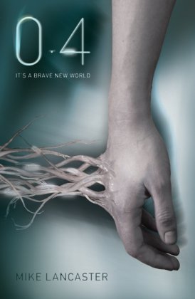
 << Hardback
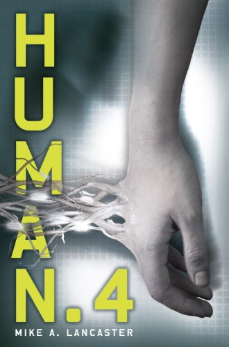
Paperback <3 <<
The HB is the USA version, the PB the UK.
They are very a like but l still prefer the PB/UK much more. I don't like the bright lighting behind the hand in the HB and also not so sure about the yellow text, l tend not to love the colour yellow on a book cover! The PB/UK is much simpler, l like how the text suits the colours of the actual books more. Although l find it hard to read the authors name whereas in the HB it's clear.
~

 >> Hardback
 Paperback <<
I can't choose between these two, l don't think either of them are good covers and sadly they don't make me want to pick the book up.
I like the gold in the HB and l think this is one cover where the yellow looks ok in the PB as it makes it stand out. Apart from that, l don't think there is much which is great about either cover
.
~

 >> Paperback 1
Paperback 2 <33 <<
I actually really like this cover! I prefer PB 2 just because of the text and l like that bit of colour to the cover. Although l like how she has her hand on his arm in the PB 1 and the text of the authors name. Also in the PB 1 it actually say what number it is in the series which l like and it makes it so much easier for everyone.
Please note, some covers l feature are
also in other formats. For example a HB cover is usually also in PB and a PB cover is also sometimes on a HB etc.
Also sometimes the PB may be a UK one and the HB may be USA.
It's just a way to compare covers.
</3 - Ok
<3 - Like
<33 Love
</3 - Ok
<3 - Like
<33 Love
Definitely hardback for the first two. I'm a bit unsure about Thirst...the covers are so similar! I guess I'll go with the paparback.
ReplyDeleteI love 0.4! I actually have no preference... as long as the cover is pretty, I'm happy!
ReplyDeletePaperback for 0.4, the yellow letters look out of place. I like the first cover for Thirst with her hand and the font, but the red is a nice addition to the second.
ReplyDeleteI agree on the first one, I really like the paperback version without the yellow. I like the monochromatic look, it adds that more sterile feel that's very sci-fi I think:) This is a really fun comparison, thanks for sharing!
ReplyDeleteI love the paperbacks for all three books :) Even though I haven't read them, they look interesting. Donna x
ReplyDeleteI'm not sure on the first one. I like both covers. The yellow probably would be more effective in grabbing my attention on a shelf though. I also like the title on the US version better just because it's easier for me to say.
ReplyDeleteI agree with you on the second book. Both are just kind of meh. Totally agree about the third book. I really like the title treatment the second paperback has, but I do like how the first paperback tells you what number in the series it is. It's so annoying when books don't have that!