 Left Drowning - Jessica Park
I love water in books, I think so many effects can be added with reflection and pretty colours. Always a winner for me!
I love this cover because :
- As I said above, I love water in books and think this cover is an example of that. It really makes me intrigued as well because of the title.. seems suitable.
- I love the font used for the title and also the pink font of the authors name. It just adds some colour to the cover.
- I like that you can't see the girls face, don't like seeing faces in covers.
- I love the font used for the title and also the pink font of the authors name. It just adds some colour to the cover.
- I like that you can't see the girls face, don't like seeing faces in covers.
Dislike :
- I think the cover would look better if the title was in the same position but just a bit smaller.
- I think the cover would look better if the title was in the same position but just a bit smaller.
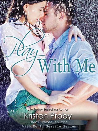 Going Vintage - Lindsey Leavitt
I have to admit, I don't usually like these covers but this one really grabbed my attention. Maybe i am in a soppy mood and in the mood for romance!
I love this cover because :
- Love the effect of the rain! It looks awesome and is definitely what grabbed my attention.
- The image is a really romantic one, I just really like it!
- Really like the colours used, the backing colour along with the rain and the white and blue tops. They just blend nicely.
- I love books that state they are part of a series, why can't more books do this? So annoys me when I buy a book to find out it's like 4th in a series!
The first... it's perfect!
ReplyDeleteI love them both, though the second one reminds me a lot of Jessica Sorenson's book. :)
ReplyDelete